What Your Frames Are Actually Saying: The Visual Choices That Separate Working Filmmakers From the Rest
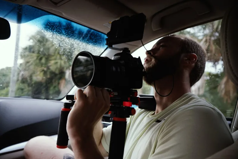
Let's settle something right away: audiences don't consciously analyze cinematography. They don't sit in theaters thinking about focal length choices or deliberate color temperature decisions. But they feel all of it. Every single frame is communicating something — even when nobody in the room could tell you exactly what.
That's what makes visual language so deceptive. The gap between work that reads as professional and work that reads as talented-but-not-quite-there isn't usually about the camera. It's about the decisions made before and after the camera rolls — the framing logic, the spatial relationships, the color philosophy — and whether those decisions are intentional or accidental.
Here's what's actually creating that gap, and how to close it.
Composition Is an Argument, Not a Preference
Amateur cinematography tends to treat composition as aesthetic preference — where does this look good? Professional cinematography treats composition as an argument — what does this say?
Every framing choice creates meaning. Headroom isn't just about leaving space above a subject; it's a statement about that character's psychological state. A subject shot with minimal headroom in a tight frame feels constrained, pressured, trapped — even if the scene's dialogue doesn't explicitly say so. Give that same character generous headroom in a wide shot and suddenly they feel small against their environment, isolated, exposed.
The same logic applies to leading room, eyeline placement, and where you position the subject within the frame's thirds. These aren't rules to follow — they're tools that work because human visual perception is wired to read spatial relationships as social and emotional information.
One of the clearest examples of this in recent indie work: Moonlight (2016) used tight, unstable handheld framing during scenes of threat or vulnerability, and wider, more composed shots during moments of connection. The camera's relationship to the subject was the emotional subtext. Barry Jenkins wasn't illustrating the story — the framing was telling a parallel story at the visual level.
The Depth Problem Most Indie Films Don't Know They Have
Flat images are one of the most reliable signals that a project hasn't crossed the line into professional territory — and most filmmakers don't realize they're making flat images until they see their work projected large.
Depth in cinematography isn't just about shallow depth of field (the blurry background look that's been overused to the point of becoming a cliché). It's about layering the frame across foreground, midground, and background so the image has visual dimension.
Professional work almost always has something happening in multiple planes of the frame simultaneously. A character in focus in the midground, a practical light source or environmental detail in the foreground (slightly soft), action or environmental context in the background. This isn't decoration — it creates the sense that the world of the film extends beyond the edges of the frame, which is what makes a cinematic world feel real and inhabited.
The practical fix is simpler than most people think: dress the foreground. Before you lock a shot, ask what's happening between the camera and your subject. A branch, a piece of set dressing, a practical object that belongs in the scene — something that gives the eye a near plane to land on before traveling to the subject. It costs nothing and it immediately adds visual complexity.
Color Grading Is Not Color Correction
This distinction matters more than most indie filmmakers realize.
Color correction is technical — making sure your footage is balanced, exposure is consistent, and the image is clean. Color grading is creative — making deliberate choices about hue, saturation, and luminance that serve the story's emotional register.
The mistake most amateur work makes isn't bad color correction. It's treating the grade as correction and stopping there, or worse, applying a LUT (a preset color profile) without understanding what that LUT is doing to the image and whether it's serving the story.
Professional color grading philosophy starts with a question: what does this story feel like? And then it makes choices that build that feeling across every scene. Minari (2020) used warm, slightly desaturated tones that evoked both memory and yearning — the grade wasn't making the image look nice, it was making it feel like something half-remembered. Tangerine (2015), shot entirely on iPhone 5S cameras, used a hot, oversaturated grade that made Los Angeles feel garish and electric — the color was character.
The question isn't whether your grade looks good. It's whether your grade is saying something.
Motivated Camera Movement vs. Movement for Movement's Sake
Camera movement is where a lot of talented indie work loses the professional audience.
The issue isn't technical — stabilizers are cheap, gimbal work has gotten democratized. The issue is motivation. Professional cinematography moves the camera when there's a reason to move it: to follow action, to reveal information, to create or release tension, to track a character's emotional shift. Amateur cinematography moves the camera because movement looks dynamic.
Static shots are not a weakness. Some of the most powerful images in contemporary cinema don't move at all. But when they do move, the movement has a job.
A useful test: after you watch a cut of your own work, ask yourself — for every camera move in the film, can you articulate in one sentence what that move is doing for the story? If the answer is "it makes the shot feel more alive" or "it keeps the energy up," that's a red flag. Those are aesthetic justifications, not narrative ones.
Spatial Continuity and the Logic of Screen Direction
This is the technical element most often overlooked in indie work, and it's one of the most disorienting things an audience can experience without knowing why they're disoriented.
Screen direction — which way characters are facing, where they're positioned relative to each other across cuts, how the geography of a space is established and maintained — is the invisible architecture of every scene. When it's consistent, audiences never think about it. When it breaks, something feels off in a way that pulls them out of the story without them being able to identify why.
The 180-degree rule exists for this reason. Eyeline matches exist for this reason. Establishing shots exist for this reason. These aren't arbitrary conventions — they're the grammar that allows audiences to build a spatial model of the scene in their heads, which is what makes them feel present in it.
Before you call it a wrap on any scene, ask: does a viewer who has never been to this location understand exactly where every character is in relation to every other character? If there's any ambiguity, you have a spatial continuity problem.
The Frame Is Never Just a Frame
Every choice in the visual language of a film is communicating something to an audience that will feel it without being able to name it. The space between work that feels professional and work that feels almost-there isn't a budget gap or an equipment gap — it's a decision gap.
The filmmakers whose indie work breaks through aren't the ones with the best gear. They're the ones who understand that every frame is an argument, and they know exactly what they're arguing.