Why Your Indie Film Looks Like a Vlog (And It's Not the Camera's Fault)
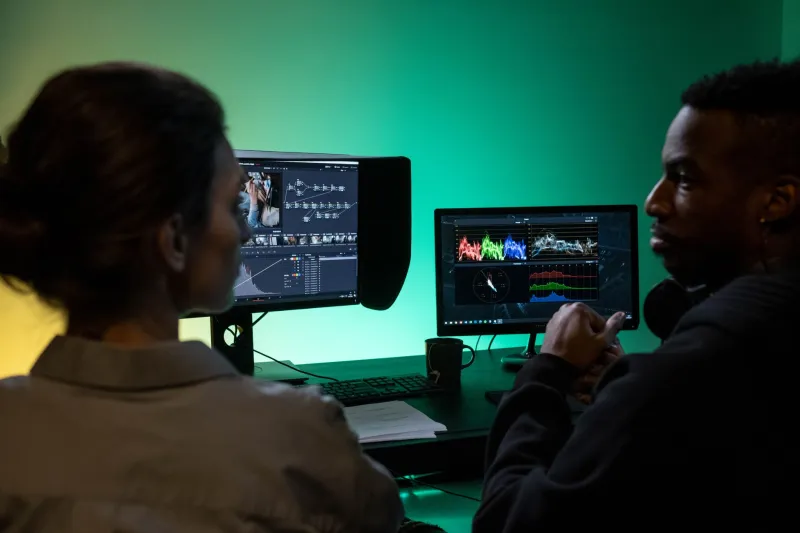
The Thing Nobody Tells You at Film School
You saved up for a decent camera. You spent three weekends nailing your lighting setup. Your DP pulled some genuinely beautiful frames. And then you sit down in the edit, slap on a quick color grade, export the file — and something is just off. It doesn't look like a film. It looks like a YouTube video from someone's basement channel.
Here's the hard truth: the problem almost certainly isn't your footage. It's what happened to it after you shot it.
Color grading is one of the most misunderstood parts of the filmmaking pipeline, especially for indie creators working without a dedicated colorist or a post-production budget. Most people treat it like a filter — something you throw on at the end to make things look "cinematic." But that mindset is exactly what's killing the visual credibility of your work.
Why Your Brain Notices Bad Color Before Anything Else
Human vision is wired to detect color inconsistencies with uncomfortable precision. Before your audience consciously registers the story, the performances, or even the sound, their visual cortex is already processing whether the image feels right. Skin tones that skew too green, shadows that go muddy brown, highlights that blow out to a sickly yellow — these things register as "cheap" almost instantly, even to viewers who couldn't name a single color theory principle.
This is the trap. A lot of indie creators assume audiences are forgiving about production quality, and in many ways they are. But bad color grading reads as carelessness, not budget limitation. It signals that the creator didn't finish the job. And that association is hard to shake for the rest of the runtime.
The good news? This is one of the most fixable problems in indie filmmaking — and you don't need to spend a dime.
The Most Common Mistakes (You're Probably Making At Least One)
Grading on an uncalibrated monitor. This is the big one. If your screen is too bright, too warm, or has boosted contrast out of the box, you're essentially color grading blind. You'll make decisions that look great on your setup and terrible everywhere else. Invest time — not money — in calibrating your display using your operating system's built-in tools, or a free utility like DisplayCAL.
Reaching for LUTs before fixing the base image. LUTs (Look-Up Tables) are great, but they're designed to be applied to a properly balanced, neutral image. Stacking a cinematic LUT on top of footage that's already overexposed or color-shifted doesn't create a look — it creates a mess. Always balance exposure, correct white balance, and lift your blacks before you even think about applying a creative grade.
Inconsistent color between shots. This one destroys immersion. Two cameras, different times of day, different lighting conditions — if you're not matching your shots to a consistent baseline, your edit will feel choppy and amateurish no matter how well-paced it is. Audiences don't know why it bothers them. They just feel it.
Over-saturating to compensate. When footage looks flat, the instinct is to crank the saturation. Resist it. Oversaturated images are one of the clearest visual markers of inexperienced post-production work. Instead, work with the HSL (Hue/Saturation/Luminance) controls to selectively boost or shift specific color ranges — usually pushing greens slightly warmer and keeping skin tones in the orange-red range.
Free Tools That Actually Deliver Professional Results
DaVinci Resolve is the obvious starting point, and it's genuinely free. The free version of Resolve is more powerful than software that costs hundreds of dollars a year, and it's the same platform used on major Hollywood productions. If you haven't committed to learning it, that's the single highest-ROI investment of your time in post-production.
But let's go deeper than "just use Resolve." Here's a practical workflow using only free resources:
Step 1 — Use the Color Match feature. Resolve's Color Match tool lets you automatically match the color profile of one clip to another using a reference frame. It's not perfect, but it gets you 80% of the way to consistency across a scene in about 30 seconds.
Step 2 — Work in the node structure, not the curves panel alone. Create a dedicated node for exposure correction, a separate node for color balance, and a third for your creative grade. This keeps your workflow clean and non-destructive.
Step 3 — Use scopes, not your eyes. The waveform monitor and vectorscope in Resolve will tell you objective truths about your image that your monitor can't. Skin tones should land on or near the skin tone indicator line on the vectorscope. Shadows shouldn't crush to pure black unless you intend it. Let the data inform your decisions.
Step 4 — Download free LUT packs from reputable sources. Ground Control, Iwltbap, and several other creators offer free LUT packs that are genuinely broadcast-quality. Use them as a starting point, not a final answer — dial them back to 40-60% opacity and blend them with your corrected base image.
The Bigger Picture
Color grading isn't about making your film look like someone else's. It's about making it look intentional — like every frame was a decision, not an accident. When your grade is working, audiences don't notice it at all. That's the goal.
The tools are free. The knowledge is accessible. The gap between indie and professional color work has never been smaller — but only for creators willing to treat post-production as seriously as production itself.
Your footage is better than you think. Give it the finish it deserves.