The Craft Nobody Claps For: Mastering the Decisions Your Audience Will Never See
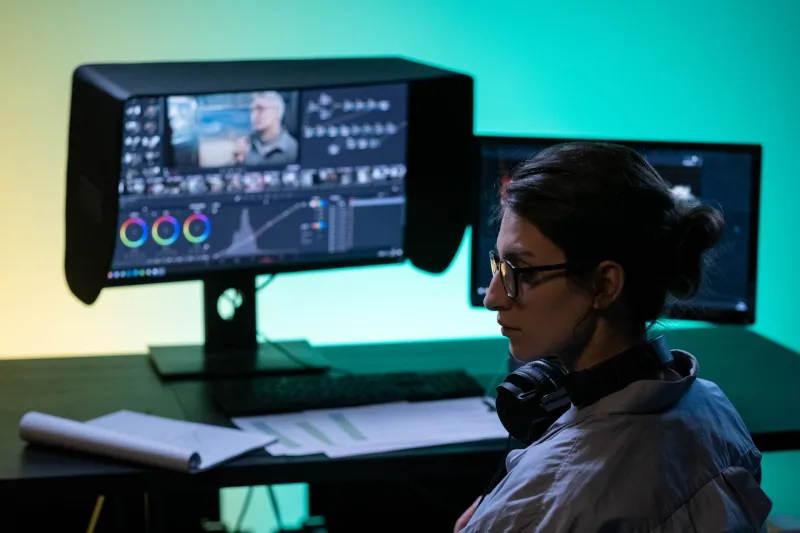
After a film screens, people talk about the performances. They talk about the story. Sometimes they talk about the cinematography if a shot was particularly striking. What almost nobody talks about — what almost nobody notices — is the work that made all of that possible.
The color grade that kept the emotional temperature exactly right. The room tone that was painstakingly matched between coverage shots so the edit felt seamless. The practical light source that was positioned just slightly off-axis to give the lead actor's eyes a catch light that made them look alive on screen.
This is the invisible craft. And getting it right is, paradoxically, one of the hardest things in production — because the only way you know you've done it correctly is that no one mentions it.
Why Invisible Is the Highest Compliment
There's a phrase that gets thrown around in post-production circles: "the best edit is the one you don't notice." It sounds like a cliché until you actually sit with what it means.
Editing, at its most functional, is the art of making time travel feel natural. You're cutting from one angle to another, jumping across space and time, compressing or expanding reality — and the audience should feel absolutely none of that machinery working. When a cut lands correctly, the viewer doesn't experience a transition. They experience continuity.
The same principle extends across every technical discipline in film and media production. Sound design isn't there to be heard — it's there to be felt. A well-designed soundscape makes a scene feel real without announcing itself. The distant traffic, the ambient hum of a refrigerator, the specific acoustic quality of a room — these elements build a world that the audience inhabits without realizing the construction happening around them.
When any of these elements fail, though, the spell breaks immediately. A poorly matched audio cut pulls a viewer out of a scene faster than almost any other technical mistake. A color grade that shifts unexpectedly between shots creates a visual discomfort that audiences will describe as "something feeling off" — even if they have no idea what they're reacting to.
Lighting: The Most Misunderstood Element in the Room
Ask most non-filmmakers what lighting does, and they'll say it makes sure you can see the subject. That's technically true the way saying a piano makes noise is technically true.
Professional lighting design is about shaping perception, directing attention, establishing emotional tone, and communicating information — all without the audience registering any deliberate effort. The three-point lighting setup that's been a production standard for decades exists because it creates a natural-looking image that doesn't draw attention to itself while still giving cinematographers full control over how a subject is rendered.
But the interesting work happens in the deviations from that standard. A key light positioned slightly lower than expected creates an unease that audiences feel in their gut without knowing why. Motivated lighting — light sources that appear to come from practical sources visible in the frame — creates a sense of authenticity that helps audiences suspend disbelief. The decision to let shadows fall across a character's face at a specific moment in a scene is as much a storytelling choice as any line of dialogue.
None of this gets noticed when it works. Which means the cinematographer and gaffer spent hours building something that, by design, disappears.
Color Grade: The Emotional Subtext Nobody Reads Consciously
Color grading is possibly the most powerful invisible tool in post-production, and it's also one of the most misused — particularly as access to grading software has become democratized.
The mistake most emerging filmmakers make is treating color grade as a stylistic filter applied after the fact, rather than as a deliberate emotional instrument tuned to the specific needs of the story. Heavy teal-and-orange grades became so prevalent in Hollywood blockbusters that they became a meme — but the reason those grades existed in the first place was because warm skin tones against cool backgrounds create a natural visual contrast that makes subjects pop. The problem wasn't the technique. It was applying it without intention.
The best color work is invisible because it's consistent with the emotional world of the story. Moonlight used color to shift the emotional register between each of its three acts in ways that felt organic rather than imposed. The cooler, more desaturated palette of Barry's middle section versus the warmer, more saturated memories of childhood — audiences felt that tonal shift without processing it as a technical decision.
That's the goal. Color grade should feel like the emotional truth of the scene, not like a filter someone applied in DaVinci Resolve.
Sound Design: The Layer Beneath Everything
If you want to understand how much invisible work goes into professional sound design, try this: watch a well-produced scene with the sound off. Then watch it again with sound but close your eyes.
The visual information and the audio information are doing completely different jobs, but they're creating a single unified experience. The Foley work — footsteps, fabric movement, object handling — exists to give physical weight to on-screen action. Without it, even a beautifully shot scene feels weightless and artificial. With it, the audience doesn't notice the sound. They just believe the scene.
The same applies to music mixing, ADR integration, and room tone matching. These are hours of meticulous, often tedious work that exist entirely to serve the story without announcing themselves.
Building Invisible Craft Into Your Own Practice
For creators at any level — whether you're producing content independently or working in professional production — the shift toward invisible craft starts with a change in evaluation criteria.
Stop asking whether your technical choices are impressive. Start asking whether they're necessary. Does this color treatment serve the story, or does it just look cool in isolation? Is this sound effect there because it adds to the world of the scene, or because you wanted to show off the plugin you just licensed?
The professional standard isn't about showing what you know. It's about making the audience feel something without them ever knowing how you did it.
The best compliment your technical work can receive isn't "that looked amazing." It's "I completely forgot I was watching a film." That's when you know the invisible craft did exactly what it was supposed to.